
The color palette makes all the difference in a decorating project! Learn more about this topic.
Several factors influence how we feel in an environment. Among them are temperature, acoustics, and lighting.
Another very important factor is color. This goes beyond aesthetic preferences, because certain colors carry different meanings and symbolism. Therefore, the distribution of colors has a great impact on interior design. It brings to light the perceptions we have about certain shades and combinations.
Personal experiences and preferences dictate our reactions to different palettes. At the same time, colors are usually associated with states of mind.
Warm colors, such as red, orange, and yellow, tend to stimulate and energize, while cool colors like green and blue are considered relaxing.
Therefore, in a decorating project, it is important that the color palette is planned in advance.
It is the palette that will set the tone for the project – no pun intended. The chosen colors determine our response to an environment, so they must meet the needs and expectations of the client.
Based on the palette, we will proceed with painting the walls, choosing the furniture and decorative objects, among other details.
The golden rule of color palettes
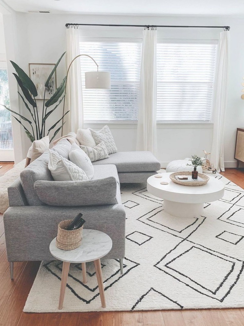
@domesticblonde/Home is Home
There’s a lifesaver rule when searching for the perfect color palette for your project: the 60-30-10 rule.
This is simply the recommended proportion to bring balance to the color scheme. 60% represents the main color for the space. This color will be present in the major details, such as wall paint, rugs, and sofas.
The next 30% is the secondary color. It’s different enough from the main color to stand out on its own, and it also appears much less frequently. Finally, the last 10% represents the complementary color. It’s in the details of fabrics, decorative objects, and lighting fixtures. It’s a color that immediately stands out and brings contrast to the palette.
Pay attention to the example below:
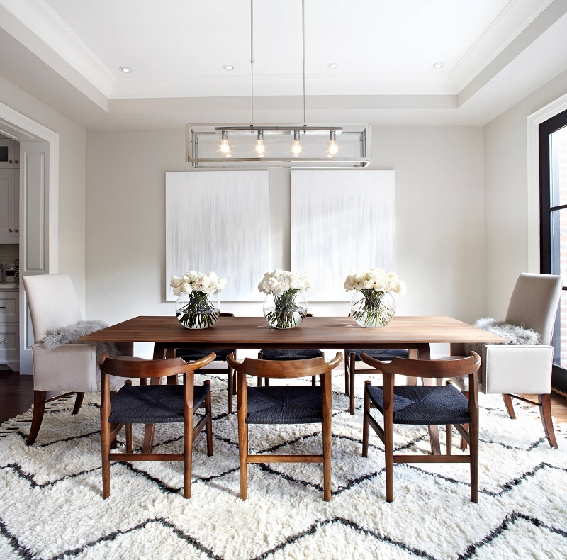
Delightfull
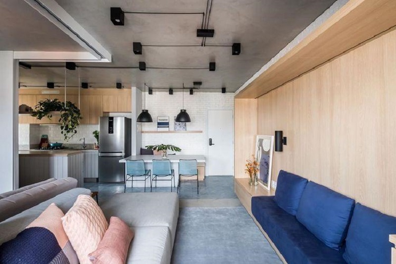
In this project, we see 60% white, 30% brown, and 10% black. The main color appears from the wall paint to details such as cushions and pictures, and also in the rug. The black, on the other hand, appears in the chair seats.
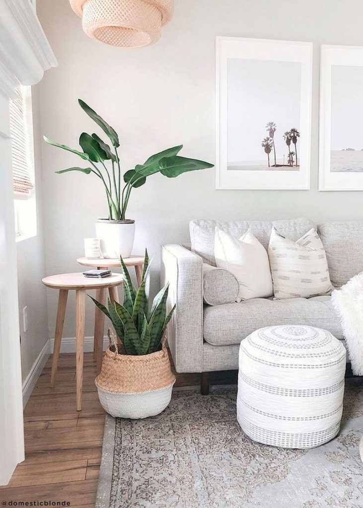
Tips for thinking about your color palette
I’ve put together some tips to help inspire you. These are some tricks that can make it easier when thinking about the colors for your project.
- Start with the furniture you already have at home.
Delightfull
Do you know that unique decorative piece that came from your grandparents’ house, or that you found by chance on an unforgettable trip?
That’s where you start thinking about your color palette.
This is because it’s much easier to create the room’s decor starting from these indispensable objects. It’s from them that the other elements are considered.
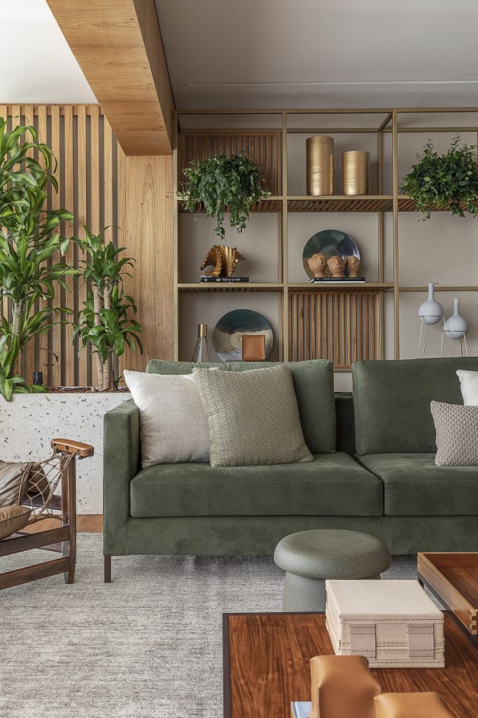
Think about all the furniture you can’t do without in your project. Don’t leave finding a place for these pieces until later. Use them as a reference, integrating the colors that stand out most into the palette. This tip is especially useful for those who need to incorporate a table, a painting, etc., into the room.
Tua Casa
Although the main color here is blue, it appears in various places in different shades, from the navy blue of the sofa to the almost grayish carpet.
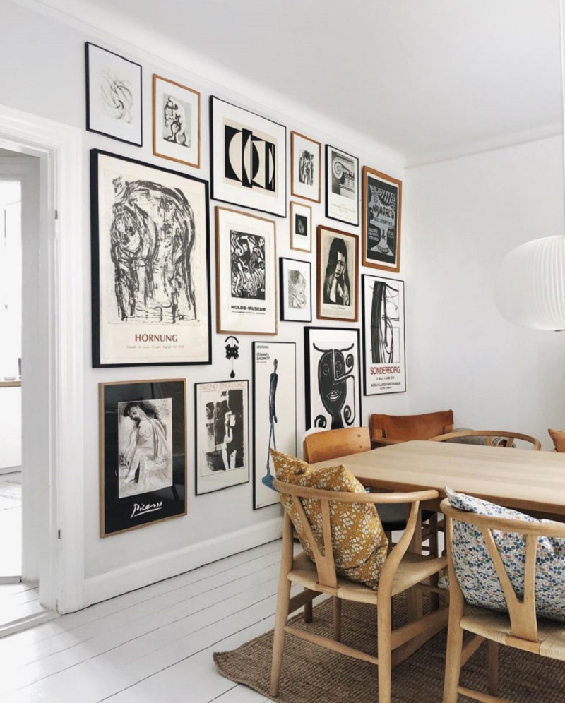
- Look for a reference.

Amazon
It’s not easy to decide among thousands of color combinations, is it?
That’s why it’s worth seeking inspiration from many different places!
Decoration books and magazines, paintings, and photos found online are classic examples. But even tapestries and fabric prints can spark your imagination.
When you see a color combination that catches your eye, identify how it makes you feel. This way, you’ll know whether or not it’s suitable for your project.
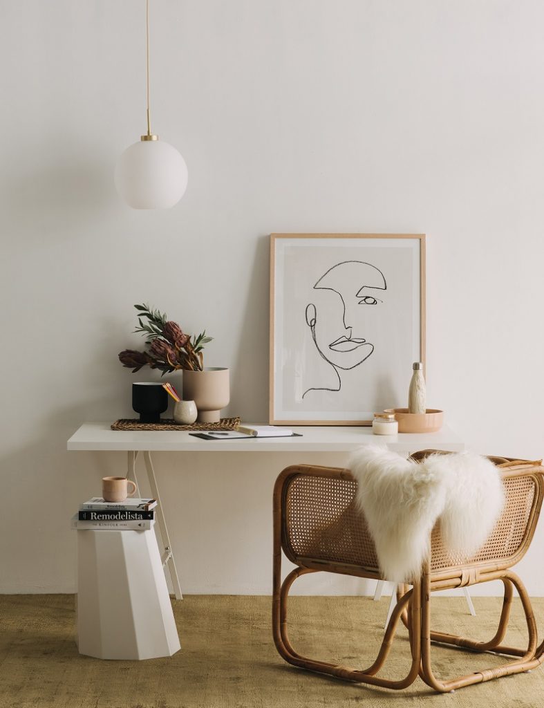
Casa Vogue
An example of how to draw inspiration from the decorative objects themselves. Pink appears in the picture frame, but is also present in the woody tone of the chair.
- Choose your base color carefully.
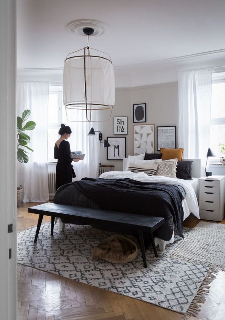
My Scandinavian Home/Bloglovin’
Considering that the base color dictates the overall tone of the environment, it’s very important to choose wisely.
White, gray, and all their variations are quite common base colors. From there, you can play with other colors in the details. This way, your project will gain even more of your personal touch.
Delightfull
- Spread the base color throughout the room.
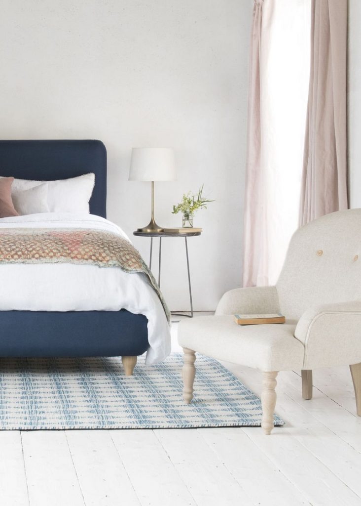
Home is Home
The base color appears in the paint on the walls, the flooring, etc. But it also makes an appearance in the small details. See, for example, how white is always present in the image above.
Here, it is the base color, and accounts for 60% of the palette. But its predominance is not only in the large spaces. It spreads throughout the decoration, from fabrics to the light fixture. In the curtain, it mixes with pink to brighten the environment.
- Use different shades.
Rafael Renzo
Once you have chosen the colors for your palette, you can let your imagination run wild and experiment with different combinations of shades. This can even influence the lighting of the space, adding more or less light to the environment.
Want to discover the ideal colors for your project? Contact us! We will help you think about the right colors for each room.